55

I am looking for a specific font used in oldish technical engineering docs (ca. 70's and earlier American electronic schematics and/or block diagrams), and I tried to identify it online, but had not found the font's name nor a download (either free or otherwise). Strange enough for a tech font, it has ambiguity between "1" and "I", and between "0" and "O".

Many, if not all, diagrams I saw scanned online for Apollo Lunar Missions used this font, for example. Same with many old valvular (vacuum-tube), transistor and even some oldish IC (integrated circuits, chips) schematics.

I think (but I'm not sure) these schematics' texts were made with a letter-rule, a plastic band with letters/numbers bored in it. A pen following the bores' edges would then draw the letters on paper. To keep machining costs down, these rulers normally used the same shape for a zero and an "O"; a capital "R" was usually made with a "P" plus a little slant, same slant was used with "O" to form a "Q". Both uppercase "I" and "1" were usually a single vertical line.

All corners and ending caps were obviously round due to the pen being so.

I tried all online font-guessing sites except the serif one, never saw this font has lowercase characters defined and uppercase is sans-serif. No site came up with a satisfactory match. Some were close, but were very different for specific glyphs.

This is an example of the font — and overall diagram style — for an early 70's avionics microprocessor, probably used in the F-16:

Early '70s microprocessor block diagram

If a free download is available, I won't mind!

3
  • 11
    Technical fonts which make 1 and I look the same can burn in hell!
    – Cort Ammon
    Commented Jan 2, 2017 at 5:36
  • 4
    I've studied that diagram very closely so I was surprised to randomly see it here. If you have any technical questions about that processor (the MP944), please contact me. Commented Jan 3, 2017 at 2:00
  • @Cort Ammon: I know and agree, but anyway I needed the font for a vintage project I -still- am working on - A valve amplifier. It's a 100% old-time match!
    – zxMarce
    Commented Jul 30, 2018 at 11:58

10 Answers 10

38

Because of the time period these are most likely hand drawn. Probably using stencil, to save time*. Using a stencil explains why 0, O, I, 1 and also the foot of R are done this way, simply they are re using the stencil to save space.

enter image description here

Image 1: Period engineering drawings were made with similar stencils. Stencil image courtesy of Smith Drafting stencil also available form same source.

Now it probably takes a few hours to make this font. And if you want the exact same look and feel you may not have much choice on the matter. If you can find a font that closely matches that is open source then just edit that font to fix the few things that bother you.

* Technical lettering by hand is a pain in the butt.

5
  • 1
    +9 FFS! I didn't even present how you can do this font in about 2-3 hours using notepad (ok so not the letter S that takes as much work as the rest combined).
    – joojaa
    Commented Dec 30, 2016 at 22:46
  • 6
    You make fonts wiv Notepad? How – by entering raw Type 1 instructions? (Slightly reminiscent of "well in my days we had to save to disk by plotting the bits with a magnetized needle...")
    – Jongware
    Commented Dec 31, 2016 at 0:10
  • 5
    @RadLexus Yes, once you get the first letter (usually E) done then the next few (F, I, L, H, T, X, Y, Z) take about 15-30 seconds each (its faster than drawing them). The upper letters are done in no time, with exception of S that is just frigging hard to do by hand. Now the lower case letters are a bit more painful.
    – joojaa
    Commented Dec 31, 2016 at 0:30
  • 1
    For anybody interested type 3 fonts are even easier to do as outlined by this post @RadLexus its then relatively easy to read into say fontforge to convert it to OTF
    – joojaa
    Commented Dec 31, 2016 at 0:47
  • I think it's plausible that they were stenciled by hand--at that resolution it's really impossible to tell. But in 1970 we had photo typesetting and, of course, just a good ol-electric typewriter could have set that type just as well. So it could just as likely have been done mechanically.
    – DA01
    Commented Jan 3, 2017 at 5:03
22

Man, this is a blast from the past. I worked in a mapmaking company in the early 1980s. The draftsmen and -women used Leroy lettering. This was a little self-contained pantograph that traced letters routed onto a stick. As I recall, the sticks we bought from Keufel & Esser.

They scribed the letters onto coated mylar, scraping off the coating. Then the mylar got blueprinted. For high end jobs it got copied in the company's twelve by eighteen foot photographic enlarger.

We had one military job. The colonel wanted us to make a template of his signature, so we could scribe it onto every map. I think our company production manager talked him out of it by asking if we could borrow his checkbook.

A couple of intrepid souls have made FOSS computer fonts to imitate the K&E templates. But that style is inimitable.

https://www.myfonts.com/fonts/nicksfonts/planscribe-nf/

https://webonastick.com/routed-gothic/

1
  • This, Routed Gothic Font, is the font I was looking for, thanks a bunch!!! I had almost forgotten I had asked the question, I had kinda given up.
    – zxMarce
    Commented Jul 30, 2018 at 11:43
21

Coniglio Sublime looks like a good digital match for that stencil, albeit with a disambiguating hook on the '1'.

enter image description here

DIN 17 SB isn't too far off, but its rounded letters like "C" have vertical straight sides, and the digits aren't very similar at all; it also doesn't have the slight "hand-lettered" irregularities that Sublime does.

enter image description here

2
  • Any free equivalents for non-professionals in a tight financial situation?
    – MRule
    Commented Jan 30 at 8:02
  • 1
    Rubik is generally in the ballpark, but not a very close match. Commented Jan 30 at 17:23
17

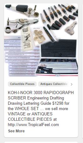
If these were lettered with ink then they used a set made by KOH-I-NOOR lettering set that had templates with the letters routed into plastic and a slot that ran the full length of the template (they came in various point sizes). You lettered using device that had three legs. I still have most of my set in my drafting table.

One was a metal fine rounded tip that would trace in the routed letter guided by the routed letters. Another was a wider styles that rested in the slot. Last it had a rapid-o-graph ink pen screwed into a rotatable arm. Rotating the arm allowed you to create italic letters. By changing pen points you could control the thickness of the lettering. You should be able to find this font if you search based on KOH-I-NOOR or RAPIDOGRAPH.

KOH-I-NOOR Lettering set

2
  • 1
    My father worked as a graphic designer for the military in the 60s, and I remember these tools always on his desk (esp. the colour-striped barrel pieces for some reason)
    – Birkensox
    Commented Dec 30, 2016 at 20:33
  • Yup! This is what we used back in the day. We called it Leroy lettering. Stencils were too slow and messy. This equipment was fast, neat, and versatile (any angle, immediately by tilting the lettering template. The coloured pen barrels differentiated the pen diameter so that it was proportional to the letter height. Letterspacing was done visually. I started using this system in the 50s and still have and use this stuff occasionally as it's fast. The electronic equivalent for me on the Mac is Arial Bold MT regular.
    – Stan
    Commented Jan 1, 2017 at 18:30
13

The standardized font for most CAD programs is ASME Y14.5M (not the catchiest name but it does its job):

font preview

It changes ever so slightly over the years, including differentiating 1 and I and 0 and O eventually. Search for the font by year (ex: Y14.5M-2009 is the font I have). It should be free.

Here is the link to get the modern, downloadable TTF version.

1
  • 2
    That's not very close to OP's example. OP's stencil font has oval O, C, and G shapes, E and F crossbars above center, and generally different proportions. Commented Dec 31, 2016 at 17:12
11

you might wanna check: http://fontzzz.com/font/10006_engineering_plot.htm

almost perfect match, just reduce the height a little and there you go.

enter image description here

2
  • 1
    This to me is the closest to the OPs requirements
    – Darren H
    Commented Jan 1, 2017 at 11:30
  • 1
    Very close fit for OP -- sadly, when I attempt to install it (on OSX), it throws errors.
    – Dɑvïd
    Commented Jan 3, 2017 at 10:00
4

Depending on how strict the glyph requirements are (e.g. a bar for the digit 1, common "zero" and upperase letter "O", etc.), there could be a viable option from FontSquirrel, Blogger Sans:

Blogger Sans

And to illustrate some text from the schematic:

text test

It comes in four weights with true italics. Adding to the appeal is the cost: free (licensed by CC 4.0 intl-public). It isn't "retro", but it evokes fairly well the "look/feel" of the sample provided.

4

In Germany one such font was standardized as the so-called "Normschrift" (the German WP page on this: https://de.wikipedia.org/wiki/Normschrift, search terms: "DIN 6776" or "ISO 3098") and there are various digital fonts based on it, such as:

4
  • 2
    Can you include a preview of that font?
    – Jongware
    Commented Jan 1, 2017 at 1:35
  • @RadLexus I thought about that, but since this page is all about graphic design it best would have to be greyscale AAed, right? ;) (Or even better yet, a vector graphic.)
    – phk
    Commented Jan 1, 2017 at 1:37
  • @RadLexus I added notes how to see a preview without having to download it.
    – phk
    Commented Jan 1, 2017 at 20:01
  • 1
    Look at the other answers - a simple screen capture is enough to show the general idea 😀
    – Jongware
    Commented Jan 1, 2017 at 20:03
2

I was excited to see this question and was reading through the answers to see if anyone would mention the Leroy lettering set from Keuffel & Esser This is a topic near and dear to my heart because my grandfather was VP of Manufacturing at K&E when they introduced the Leroy system. As I heard the story, the templates came in from one source and the pens from another and he put them together as an integrated product. I am sure other manufacturers did the same but I don't know if K&E was the first.

1

A few things on this font, like the wide/high 'R' and the 'G' with no tail look a bit like Venus, and that would be my suggestion if you wanted a "professional" font with a similar aesthetic. But this is could be a custom design by a maker of blueprint printing equipment That's just my guess here - I don't know how these were printed or what tech was used - but it looks a little cleaner than stencilled lettering would be.

Your Answer

By clicking “Post Your Answer”, you agree to our terms of service and acknowledge you have read our privacy policy.

Not the answer you're looking for? Browse other questions tagged or ask your own question.