4

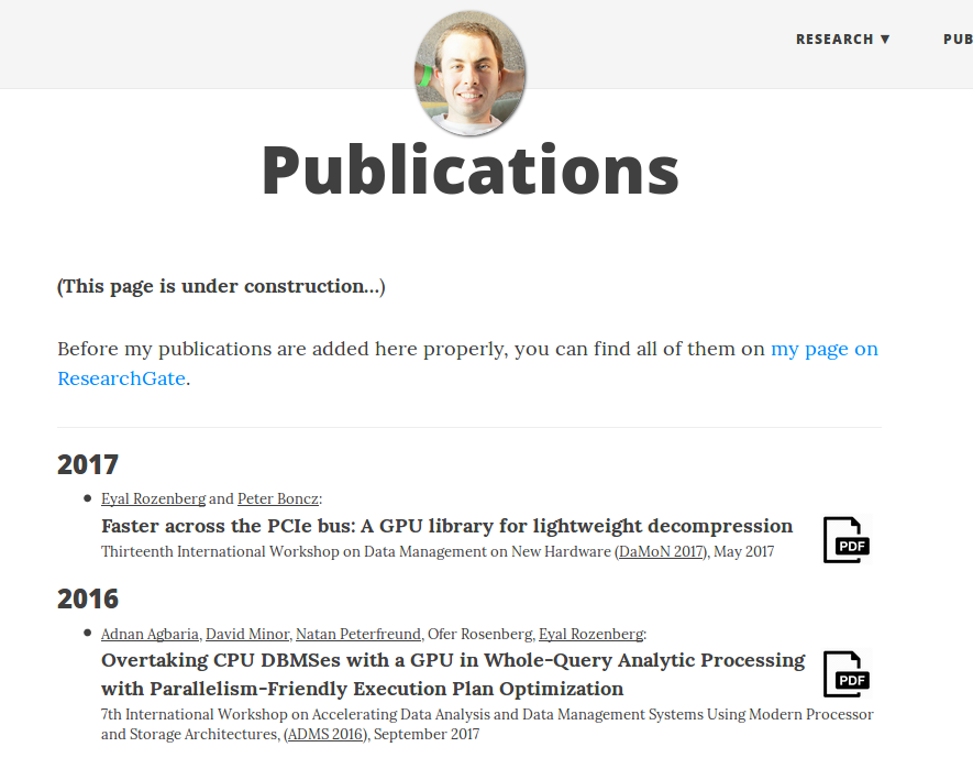
I'm tweaking the design of this page on personal website. I'm not pleased with the way the publication author names with links are emphasized right now - with an underline. Other options I've considered and rejected:

  • Emboldening: This would suggest they're more important than the unlinked authors, and it stands out too much.
  • Italicizing: I think it would feel too noisy, especially since the font is small and it's not running text.
  • Semi-emboldening: The font family doesn't support it.
  • Switching font family: Maybe, but - again I'm worried about too much noise, and anyway, what would I choose? The main font is Lora (not my choice - it's the website's template). I have no idea what would go well with it.
  • Playing with the text's intensity (i.e. graying more or less): I dunno, isn't that problematic with a small, light font?
  • Adding a background: Can't think of any way that would not be horrid.

So, was I too hasty in ruling all of these out? Is there something else I can do?

Screenshot:

enter image description here

Notes: If you think I'm doing something else wrong, I guess any criticism is welcome.

4
  • How about slightly darker grey (or no difference at all) and then a subtle external-link-arrow icon after the name? Commented Jun 4, 2017 at 16:26
  • This seems like more of a CSS targeted question rather than Graphic Design.
    – CU3ED
    Commented Jun 5, 2017 at 3:15
  • 1
    @Ce.: CSS is just a tool here; but it's true that it sort of shaped the possibilities I was thinking of. Non-CSS ideas are certainly welcome...
    – einpoklum
    Commented Jun 5, 2017 at 9:05
  • @JanusBahsJacquet: External link arrow... Hmm. I'll try it. I'm worried it would be too cluttering though.
    – einpoklum
    Commented Jun 5, 2017 at 9:06

3 Answers 3

1

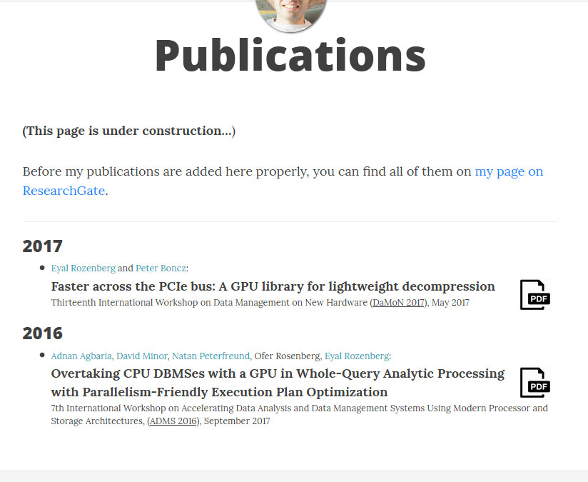
Janus' suggestion is pretty good. Despite being an extra element a trailing external link icon will look lighter and more balanced than underlining. You could even use a version with the arrow only, no square, to make it cleaner.

External icon example

You could change the color, although it's almost as disruptive as underlining the names.

Colors example

You can also use italics as you said. Yes, it decreases legibility, particularly in less than ideal reading settings like mine¹. It's not a long text though, it's just a couple of words, and this font family has beautiful italics.

Italics example

I don't know what are the conventions in your field, but it'd be nice to add a "Co-authors" before the names. That by itself will add a little emphasis to their names.

¹You can see how text is thinner in my screenshots. That could be a concern given the size of the text. In cases like this the text tends to look worse when you use dark colors, more jagged and less legible. You may not want to make the names darker and italic at the same time.

Related to the page presentation but not the question itself: Your statement about ResearchGate is worded in a roundabout and slightly negative way. It's hard to figure the point of the sentence until finishing it. It happens because you're accidentally emphasizing the lack of new publications on your publications page when you're actually trying to point the visitor towards you latest publications.

You could rephrase it as "You can find my latest articles at ResearchGate.", "Visit ResearchGate to keep up to date with my latest work." or anything in the same vein.

Also, is the page literally "under construction"? Or is it being constantly updated to include your latest publications? The page looks pretty functional to me. Unless it's lacking some vital functionality you can drop this statement, it disrupts the flow and isn't the best practice to point out a missing feature. If it's referring to constant updates you can reword and merge it with the ResearchGate paragraph, or just drop it as well because it's implicit it's updated with new information: It's a timeline.

0

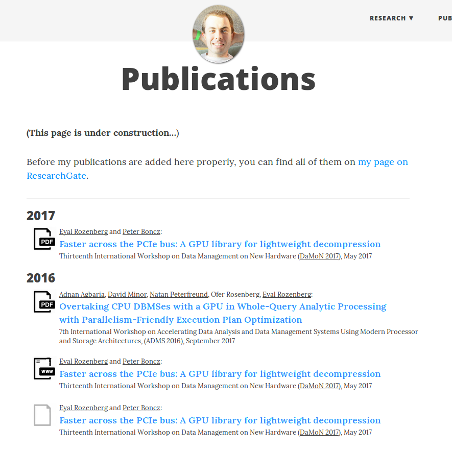
I think it's largely fine, but I do wonder why the PDF icons aren't used as the bullets on the left rather than floating icons on the right.

I would also ask, if they are links, why don't they visually match the other link on the page (My page on ResearchGate)? At least in color.

The (desktop) browser window must be a minimum of 1400px wide or your headshot coves the navigation items. (I keep my browser at about 1200px wide... anything more is pointless 99% of the time).

Random idea with web link and one with no actual link.....

enter image description here

4
  • The links don't visually match the other links since: 1. I don't want viewers to think of the list as a bunch of links (and it's mostly links) 2. It would make almost all of the publication list blue (while regular links are blue standing out from the surrounding black). About the headshot covering the nav items - yes, you're right. Theme designers must not have considered that many items; I'll try to squeeze them somehow.
    – einpoklum
    Commented Jun 4, 2017 at 16:16
  • Reasons PDF links aren't the bullets: 1. It hasn't occurred to me. 2. Some items may not have PDF links, but rather web links, or no links at all.
    – einpoklum
    Commented Jun 4, 2017 at 16:39
  • @einpoklum At least as a standalone statement, "I don't want viewers to think of the list as bunch of links (and it's mostly links)" sounds like "We sell mostly cars, but we don't want our customers to know we sell cars".
    – Joonas
    Commented Jun 5, 2017 at 8:25
  • @Joonas: Not really. The list can and should be viewed as just that - a list of items. It can and should be read without following any links. It's only if you want more details, and curiously bring your mouse closer, that I want you to be able to notice there are actually links.
    – einpoklum
    Commented Jun 5, 2017 at 10:00
0

For the sake of consistency: keep all the links looking the same. You don't want your users to not know about the links, otherwise you might as well not include them.

The font sizes are already different, so I don't see why you need yet another visual cue for hierarchy. An icon would definitely add clutter, since there are multiple author names per line and they are small.

Either make them all the same color, all of them underlined or (preferably) both.

Your Answer

By clicking “Post Your Answer”, you agree to our terms of service and acknowledge you have read our privacy policy.

Not the answer you're looking for? Browse other questions tagged or ask your own question.