7

I created this logo for a client, and I now need to convert it into one color versions (all black/all white).

Because there are so many overlays of text and graphics, I am having issues changing it into one color without it becoming one big blob of unreadable text and graphics.

I am working in Illustrator CC 2018 and have tried all I can think of with compound paths and pathfinder options. I'm sure there's a way to accomplish what I need to, I just haven't found a way to get there. I would greatly appreciate any suggestions on how to make this work!

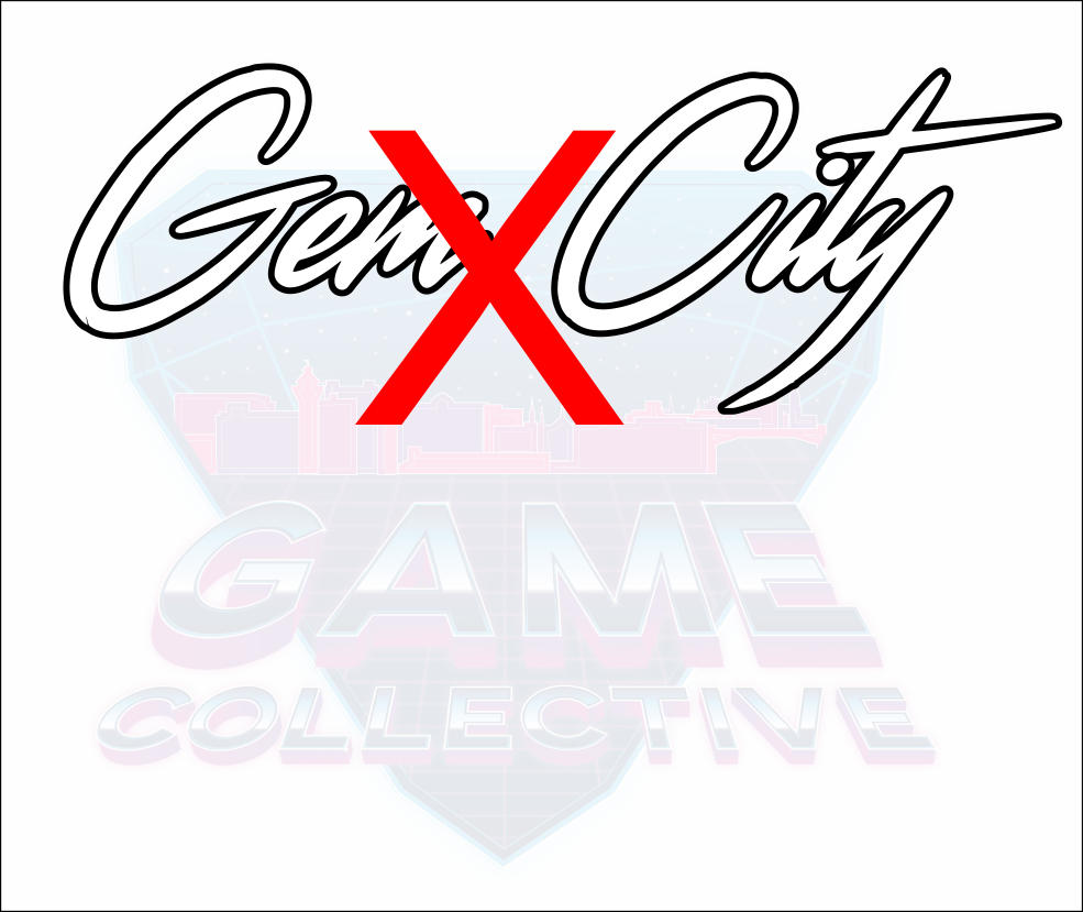
Logo: Gem City Game Collective Logo

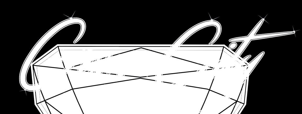
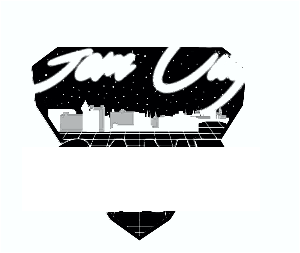
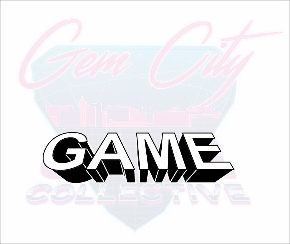
Example of issues I'm running into:
(The black lines are actually cut through to the background, they're not just black strokes.)

GCGC Logo Issue


UPDATE

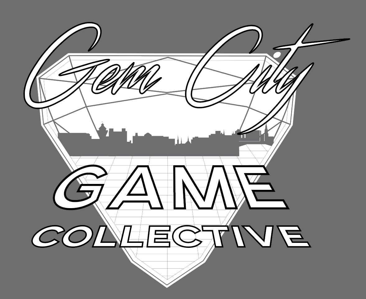
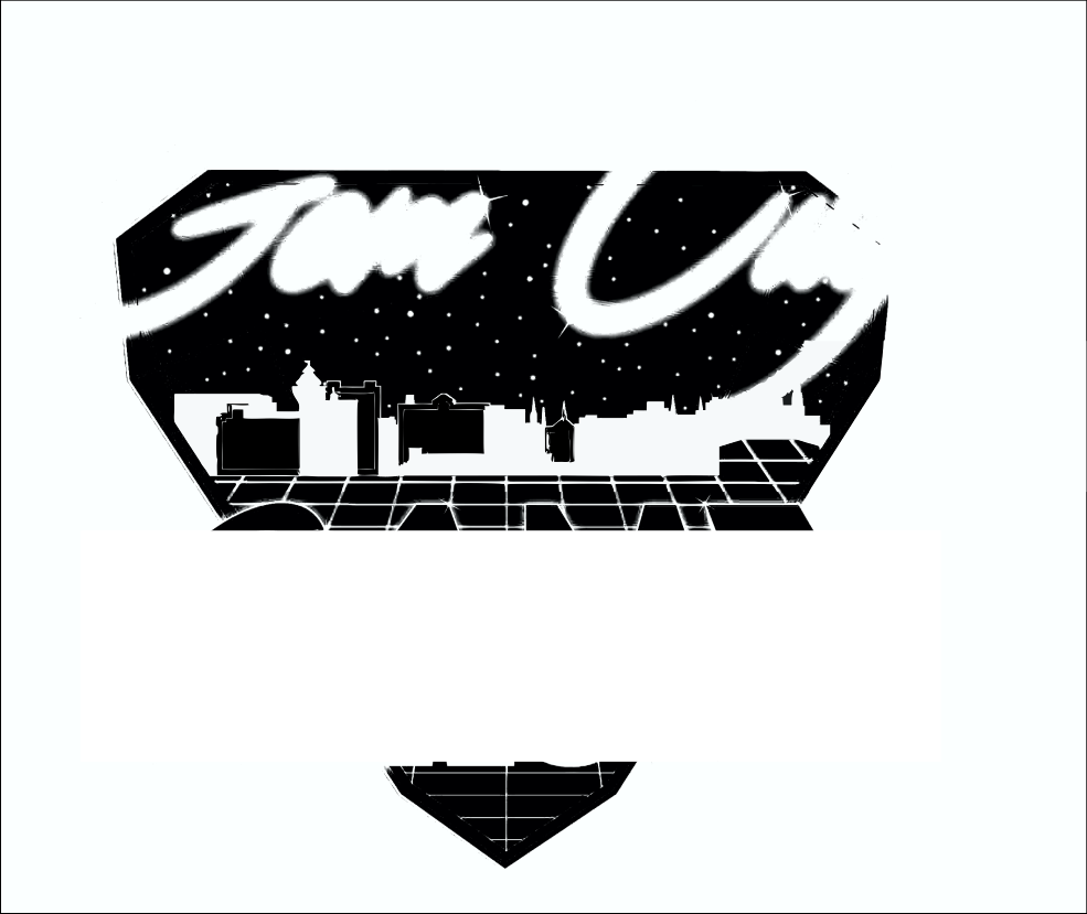
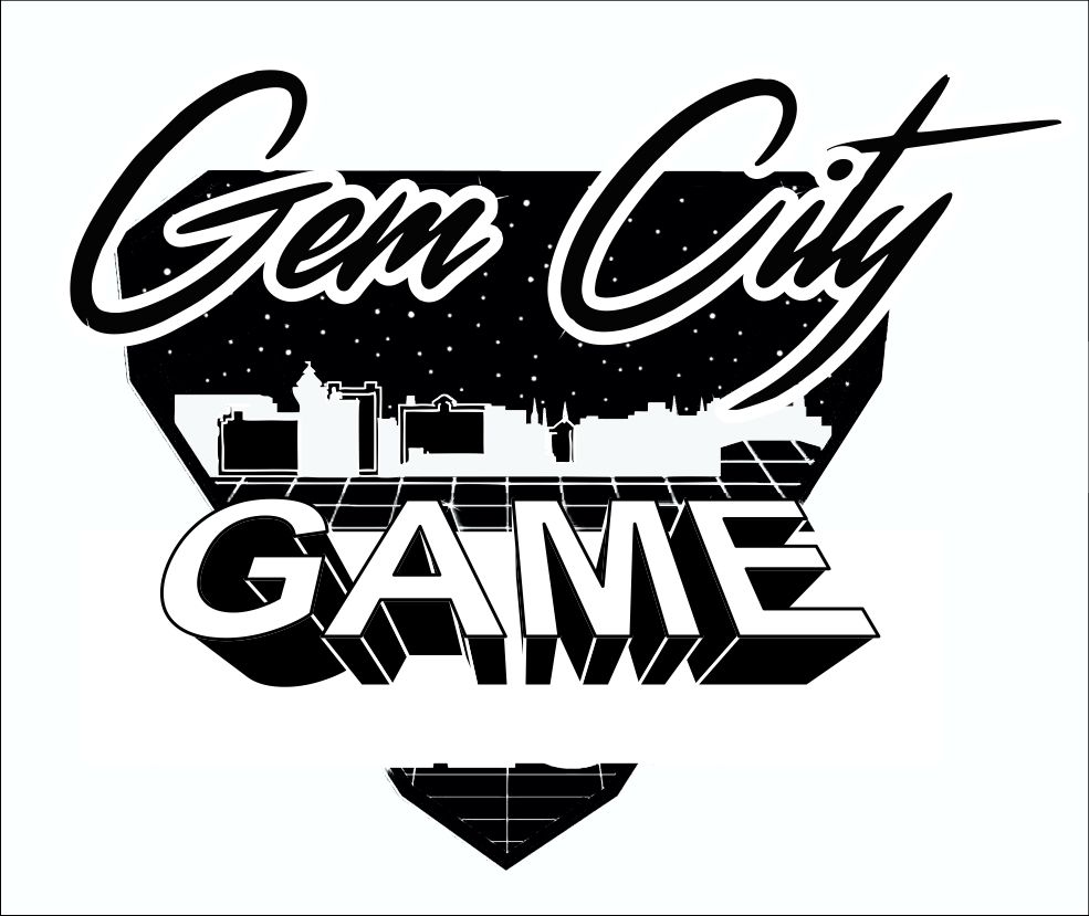
I have come along this far in the conversion. The last thing I'm stuck on is how to get the stroke around the text (what you see in black) to punch through to the background. I've been able to do this for the other graphics but am having trouble with the text itself. Any option I try in the pathfinder panel gives me unwanted results. What's the best way to achieve this?

GCGC Logo White - Mid Conversion


UPDATE 1/8/18

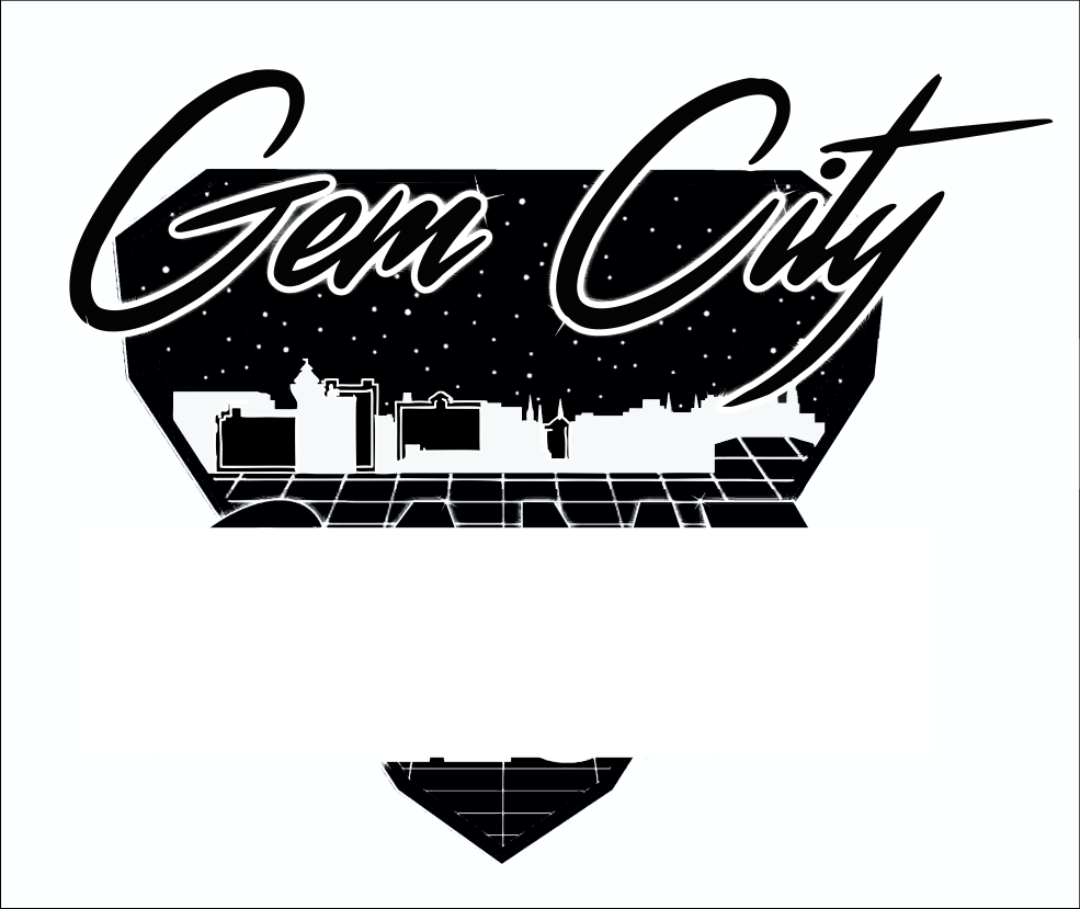
I had left this project over the holidays, and when I came back to work on it today I finally figured out a way to "punch" the text through the various background items.

First, I selected the letter and added an offset path around it. I then copied and pasted [Cmd + F] that offset path a particular number of times (equal to however many background items that letter touched).

I selected one copy of that letter's offset path, added one background piece to the selection [by holding the Shift key and using the Direct Selection tool], then clicked the Minus Front option in the Pathfinder window. I repeated this process for each of that letter's offset paths and the items it touched, and then for all of the letters that needed to have the "punched through" stroke effect.

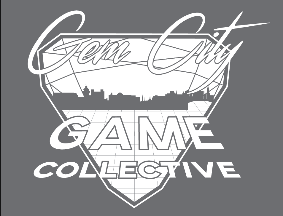
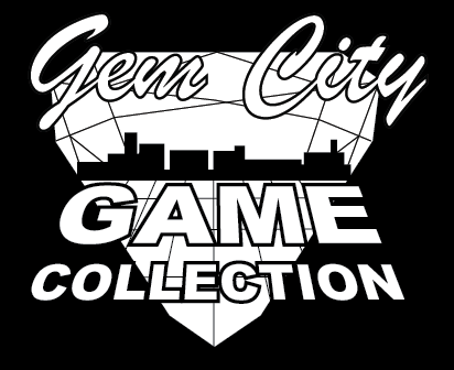
This achieved what I needed!

GCGC Logo White Version

7
  • 2
    This is the reason why you usually start wwith the black and white version. Also it usually makes your logo better since its more readable.
    – joojaa
    Commented Dec 19, 2017 at 17:27
  • Right Click > Convert Text to Outlines (That will make your text a vector path, so that you can punch it through)
    – Welz
    Commented Dec 19, 2017 at 17:32
  • @WELZ I do actually already have them converted to outlines. And what I'd ideally like is just that area that you see as the black stroke to be the part that's punched through, not the whole text shape itself. I haven't quite figured out how to accomplish this. Maybe if I have a duplicate layer of the text with an offset path and use that as the part that punches through and the white text sits on top? I'm going to try playing around with that next.
    – SJF
    Commented Dec 19, 2017 at 18:39
  • Maybe converting the outlines to stroke will accomplish what you're looking for.
    – Welz
    Commented Dec 19, 2017 at 18:40
  • @WELZ Could you elaborate? I've tried creating duplicate text layers, selecting those and the gem background, and using the minus front pathfinder option, but that doesn't give me the results I want. I need the outline you see above in black to be the part that's punched through, but I haven't been able to figure out how to do this.
    – SJF
    Commented Dec 20, 2017 at 16:05

7 Answers 7

4

You need to understand several things. If you do not separate the "fundamental" vs. the "accidental" you are flying blind.

Your artwork is an illustration, not a logo. A logo is defined by a shape, not by a gradient, not a lens flare, not a color.

I present you, your logo. And in this illustration is a dark image over a background.

enter image description here

It is not a white shape with an outline. The outline is an "accident" it is not the shape.

enter image description here

Then we have a background, a gem with stars, a city, and a grid. Yes, if you worked on that idea you potentially merge into a logo, but not as it is.

Let's see some examples of a gem logo Gem Logo search

But let us work on what we have. Let's contrast this. Dark night, bright stars and grid (the method I used "deleted" the lines on the upper part of the gem, but you got the idea):

enter image description here

We have a problem with the cityscape, but it is starting to get a shape, some buildings in white, some in black.

enter image description here

The black ones are not well defined, so we are going to rely for the first time upon the outline. The same as the outline of the logo (the real logo).

enter image description here

Now the title. Yeap, that is a title, not part of a logo. The problem here is that as it is it relies totally on the simulation of the material but that effect depends on the gradient, and a gradient is not black/white but grayscale. You probably need to redo that part with simpler shapes.

enter image description here

So, you need to understand the elements one by one. Of course, you can make adjustments on the values of the outlines, etc. As you have the source files you can work better on this version.

Here I made the outline of the logo wider.

enter image description here

Understand the elements, why they are dark, why white, what is a background, what is important, what is the shape, what is the proportion, what is just an effect.

3
  • Thank you for this in-depth explanation of what I've created. However, it does not answer the question I added in my update to the post and have asked in the comments. The only thing I need to know now is how to punch the "stroke" around the text through the background element. (I put this in quotes because it's not a real stroke - it's just to show the part I mean. It can be outlined or a separate layer below that extends beyond the outlined text above it.) I have so far been unsuccessful in figuring this part out.
    – SJF
    Commented Dec 21, 2017 at 16:46
  • 1
    That may be the case but you would do well to take on board what is being said for the future. You have created an Illustration, not a logo and in doing so created a large rod for your own back. Study Brody who combined image with text but in a much simpler, more effective manner. Commented Dec 27, 2017 at 9:31
  • +1, This might not have been the answer the OP was looking for but I found it was very helpful and interesting.
    – Ambo100
    Commented Jan 3, 2018 at 0:49
3

The artwork would need to be simplified. You may need to redo parts of it.

If you consider the lettering issue, a single black outline around the text might be one way to proceed, and a solid black shape of the city skyline perhaps.

This is very rough, but I'm sure you get the general idea.

enter image description here

Or perhaps have the diamond fill black, with a white outline, and the lines inside white

enter image description here

One problem with these which I don't think is solvable, is that the artwork is still very complex. With this in mind, it might have been better to begin with a much simpler design if you had known it would have to be reproduced in a single colour.

1
  • I'm not expecting all of the complexities of the logo to transfer over to one color. Obviously all gradients and finer details would disappear. I appreciate your examples and will continue to work on this!
    – SJF
    Commented Dec 19, 2017 at 16:17
1

You're unlikely to find a way to automagically convert something that complex; so you'll have to manually re-do everything in a single color.

You have all of the paths, so you shouldn't have to re-draw anything, but you will need to go through it all manually adjusting everything. Probably a single element at a time. Without seeing how the artwork is constructed it's impossible to give any specific advice, but plan how you want the logo to look first, don't just randomly go in changing everything. That may be printing it out and drawing over it or just sketching it out again, it doesn't matter, but have a plan of action and a vision before you start.

The single color version should really just be simple paths, with no gradients or shadows or glows or anything like that; what you need is a single shape. So your best option is probably to remove the appearance attributes from everything then start reapplying color from the bottom up. You can use two colors (e.g. black and white) then simply use Pathfinder's Unite command on the whole thing and removing one of the colors once you're done.

...

Ideally a logo should always work in a single color. That means you can use it to create a stamp, have it engraved, laser-cut... whatever. There's nothing wrong with having a full color, all bells and whistles version too, but the single color version should come first (or at least be considered at the same time). Otherwise you have problems like you're facing now... which if you haven't considered and have already priced up the job for your client means someone isn't going to be happy (either the client because of the extra costs, or you because of the extra time you've got to spend).

See also Should a logo always work in black and white?

3
  • I am aware of all of this, and I have been working manually to change all of the elements to single colors. However, as you can see, I have thus far been unsuccessful in finding a way to separate the text from the main background element when they are the same color. I'm looking for suggestions on how to do this when they are elements that must be included.
    – SJF
    Commented Dec 19, 2017 at 15:44
  • @SJF either the text needs to be a different color from the background or you need to give it a border, there's not really any other options
    – Cai
    Commented Dec 19, 2017 at 15:59
  • Any thoughts on how to get the stroke around the text to punch through? I've tried creating duplicate text layers, selecting those and the gem background, and using the minus front pathfinder option, but that doesn't give me the results I want. I'm at a loss.
    – SJF
    Commented Dec 20, 2017 at 13:31
1

One approach you might find helpful is to edit the colors directly via global swatches. If you didn't use global swatches to create the original, you can easily assign them automatically.

  1. Delete all of your current color swatches to reduce swatch clutter. Judging from your image, your swatch list is about to get a lot of new additions.
  2. From the swatches flyout menu, select "Add used colors." This will create a global color swatch for every color used in the artwork and assign the swatch to each object that uses it, including gradients.
  3. Change the color mode of each of the global swatches to grayscale. This will be a bit tedious if you have a ton of swatches, but it goes pretty quickly.

Once that is done, you can tweak the individual swatches as desired to boost contrast where it's needed.

To be clear, this method allows you to manage and edit the illustration's colors without selecting any of the individual components. It's very handy for complex images like yours.


I hope this helps!

0
0

Automatic creation of line drawings is an ongoing research area. You might try playing around with https://github.com/SSARCandy/Coherent-Line-Drawing but I'm certain you will need to clean up whatever it produces.

0

Simple adjustment only. Just Try if it work. 1)First Export it as PNG in High resolution or Directly drag the file to photoshop(rasterize it later). 2)Open it in Photoshop>Use black and white effect> adjust the lines or color you want to pop up. 3) Save (See if you have option for saving SVG or PDF because you can revert it back to AI but now the Gradients are pure Black and White)

0

As other answers mentioned, there isn't really an automatic way of doing this, it would have to be done manually.


You said you were trying to get the stroke from the text punched out, so here you go:

Select your Text Paths → Clone (Ctrl/Command+C: Ctrl/Command+F)

Then go to Object > Path > Outline stroke (this will convert your stroke into paths, depending on how thick your stroke is is how the paths will be shaped)

Then you can just punch out the "outline part" using Pathfinder

Window → Pathfinder (Shift+Ctrl/Command+F9)

1
  • Unfortunately this doesn't seem to be working for me. It gives me very strange results, no matter which option in pathfinder that I try.
    – SJF
    Commented Dec 21, 2017 at 16:47

Your Answer

By clicking “Post Your Answer”, you agree to our terms of service and acknowledge you have read our privacy policy.

Not the answer you're looking for? Browse other questions tagged or ask your own question.