26

I'm trying to programatically detect if a color is "gray" or not.

The best measure of "grayness" I could find was the saturation. The problem that I'm running into is that different hues look more or less gray depending on their hue and lightness. In the picture below one looks distinctly gray and the other one red/brown even though both have the same saturation and lightness.

Is there a color space that more accurately represents "grayness" of a color?

Is there an official term for the concept of "grayness"?

two gray tones

6
  • Does this answer your question? Color Theory: Is there a measurement of "colorfulness"?
    – Luciano
    Commented Sep 15, 2020 at 8:15
  • 2
    You can’t, because ‘grey’ is not a quantifiable measure. What I consider grey may not be what you consider grey, and what I consider grey in isolation may not be what I consider grey in context. Given the two boxes you include, I would say the right one is grey and the left one isn’t. Take them individually and I’d probably say the left is a beigish brown and the right a brownish teal – neither is grey. Put either in a brightly mottled image and I’d likely call them both grey. How would you programmatically determine that? Commented Sep 15, 2020 at 9:26
  • 8
    Notice how the two colors seem more equally non-gray if you add a neutral gray between them.
    – Wolff
    Commented Sep 16, 2020 at 11:43
  • 1
    I wonder about a linguistic/cultural effect too: "blue-grey" is a common term in English (which could be applied to the right-hand sample). The closest common description for the left sample would be "reddish grey". "Reddish" modifies "grey", while "blue-grey" is a single colour adjective. The cultural linguistics of colour perception are one of many interesting factors. H=120° keeping the others the same is greenish grey or even greyish green to me; "green-grey" is also uncommon (though "grey-green" is more common, for which we might have to thank Kipling)
    – Chris H
    Commented Sep 16, 2020 at 15:17
  • 5
    @ChrisH this has been known by paper salesmen through the ages. Cultures on higher latitudes think that blueish colors are more neutral. While countries nearer equator are predisposed between yellow and red. This is partly due to the sky and soil affecting our white balance and partly cultural
    – joojaa
    Commented Sep 16, 2020 at 16:21

5 Answers 5

23

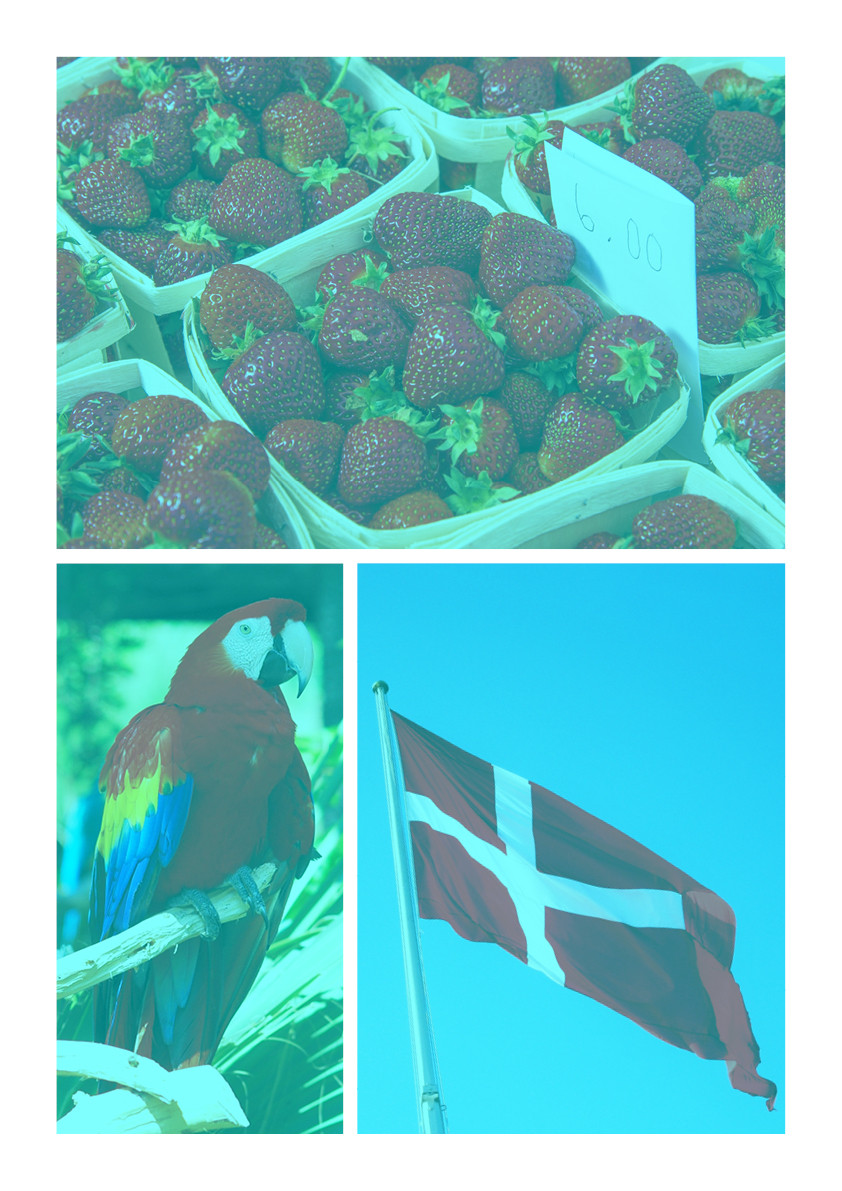
With full credit to @Wolff for these images. As was discussed, grey is 100% relative to lighting, surrounding colors, perception, and the method you are measuring. Take these images for example. The main image actually has no "red" in it at all. If you take an eye dropper and measure any area that looks red, they are all actually shades of grey.

Not Red, Red images

if you take a snip of the parrots wing and take it out of context, it looks like browns and greys.

Parrot Wing Snip

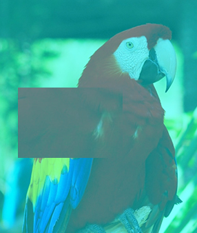
If you put that exact same snip back over the parrot, it looks red again in context with the blue/green.

Combined

But that being said, LCH or LAB would be your best bet to measure for neutral grey.

@Luciano's recommendation of this article: Color Theory: Is there a measurement of "colorfulness"? Has some good information for what you are trying to do.

8
  • 12
    Yeah, it's fascinating how the human brain processes colour. Here's another example: both eyes are the same shade of grey 7f7f7f
    – Billy Kerr
    Commented Sep 15, 2020 at 17:58
  • 3
    The infamous dress is also a pretty striking example where different people actually see the exact same pixels as entirely unrelated colors, because they interpret ambiguous lighting cues differently.
    – Kevin
    Commented Sep 16, 2020 at 17:08
  • 1
    "There is no red here." Why oh why don't I believe you!?
    – Jongware
    Commented Sep 17, 2020 at 15:43
  • The mobile game I Love Hue (and presumably its sequel, though I'm still working through the first edition) makes great use of this phenomenon. The premise is simple: Arrange a set of colored tiles into a smooth gradient, with every tile adjacent to its closest neighbors. But I've so far spent... 72 hours, my phone says, doing just that, in part because of how wonderfully frustrating it can be when a tile from clear across the board, which can't POSSIBLY be the right fit, seems to magically change color when you move it.
    – FeRD
    Commented Sep 17, 2020 at 16:13
  • 3
    I promise there is not. Open it in photoshop and select any pixel, there are no "red" tones in the image.
    – Alith7
    Commented Sep 17, 2020 at 18:09
9

RGB or actually the saturation in its polar coordinate equivalents is highly nonlinear when one tries to use it as a measure for "how near grey this RGB color seems to be when watched on the screen" It doesn't at all take into the account human color vision, it's purely for controlling the screen electronics. You have knocked your head to that fact.

You should instead of it convert your RGB values to LCH system and extract C (=chroma) or to CIELAB system (=Lab in Photoshop) and calculate sqrt(a^2+b^2). Those systems are developed to be more linear in predicting what's seen. For grey C=0 and a=b=0. This is of course a lie if the screen isn't color calibrated.

ADD due comments: The questioner very likely believes his program doesn't get fooled by anything else what it has seen, it can concentrate to a single RGB combination at a time. I guess the questioner expects something that could help his program make the same decision than a perfect colorimeter would do when it reads the same RGB outputted by a faultless sRGB screen with no disturbing extra lights.

2
  • 2
    There are also other problems associated with human vision such as the whitebalance of a human eye. I have a 3d printer spool of recycled "gray" color. But I swear its green in my workshop since my neutrals are so prominently neutral. But if i take itto the wood workshop thats much more warmer it really looks gray. Hell even sometimes in my workshop its gray. So in fact what is gfray is a sort of under constrained question.
    – joojaa
    Commented Sep 15, 2020 at 8:49
  • @Wolff and some of the rest of us were having a great conversation about how to produce a red image that actually has NO red in it in chat last week.
    – Alith7
    Commented Sep 15, 2020 at 14:00
4

I do agree with the perception of colour already mentioned. There are warm grays and cool grays, but the grayest of all would be a neutral gray.

Looking at RGB values, if all 3 numbers are the same, that is neutral gray, such as R109 G109 B109, or R228 G228 B228. If one number is slightly different, it will tone the gray either cool or warm.

Looking at HSB values, to me it seems that it doesn't matter what the HUE is, as long as the saturation is 0 it will be 100% gray. If you up the SATURATION by any percentage, then you will get a tone of whatever the HUE is.

So, as a graphic designer, I would argue that any SATURATION value lower than 4% would be considered gray, but it could be a cool gray, or a warm gray depending on the HUE value (even if it's 0).

The programmer still has to make the final call as to what is considered gray, unless you only want it to detect 100% gray, then it's easy.

4
  • This was my initial thought as well. But isn't the "similarity of RGB values" just another word for "saturation"? The OP shows an example of two colors with the same saturation which they think don't look similarly gray. That adds to the complexity of the question.
    – Wolff
    Commented Sep 16, 2020 at 10:16
  • 1
    Saturation is the intensity of a colour (not brightness, not hue). The OP shows two colours with the same saturation of 12%, but different hues, that is why they look different. As the saturation decreases, the more similar those two boxes will look to each other.
    – Ash
    Commented Sep 16, 2020 at 13:38
  • I think you're absolutely correct - a saturation of 12% is too much but at 4% you could be much more sure. Commented Sep 16, 2020 at 16:28
  • "The programmer still has to make the final call as to what is considered gray," – isn't that only part of the problem? Not only will that limit be different for each programmer but also for different monitors, and in the case of color managed dislays, it also depends on the software!
    – Jongware
    Commented Sep 17, 2020 at 15:46
2

HSL is the best color space to represent grayness.

Grayness can be seen as a distance S (saturation), which is 0.0 if pure gray, and 1.0 if it is the farthest from gray.

Measure and perception

In the two samples provided I measured (with Photoshop eyedropper): 0 10% 49% and 216 12% 51% which differs a bit from what you claimed, maybe due to a color profile being dropped in the publication process.

With a calibrated Eizo CG303w (120cd/m2 5000k 2.2), I have the feeling that the one on the left tend to the red and the one one right on the blue. I lowered the saturation until I had the feeling both were gray, I reached 4% and 5% saturation in the HSL space.

My 5000k for the white point is a bit warm, and I see the brown patch more colored than the blue one. Likely a white point at 5500k-6500k would be better and we should also make sure that ambient light (idealy a calibrated light such as Just) and wall color (white, dirty white ?) are in the range of acceptable grayness.

Discussion

In RGB, a color is gray when R=G=B, but the operator needs to evaluate several numbers in order to answer to "is it grey". It is harder to give ourselve a distance from R=G=B just by looking at the numbers.

HSL color space is more direct since S (saturation, in the range [0,1]) gives immediately the answer: 0 is grey or a value below a threshold is chosen to be gray.

R' = R/max // normalization from [0-max] to [0.0-1.0]
G' = G/max // where max is 255 if the colors are 8 bits per channel
B' = B/max
Cmax = max(R', G', B') // find the maximum among R,G,B
Cmin = min(R', G', B') // find the minimum among R,G,B
Δ = Cmax - Cmin // gives the maximum difference

And yet, L and S are given by:

L = (Cmax + Cmin) / 2
S = Δ/(1-|2L-1|)

Hence you can build an indicator filter than will display say in pure green when pixels are pure gray or enough gray; or that will display in false colors all the gray enough pixels, and destaturate the rest. Implementation will depend on your software and langage; you can create a Matlab filter for Photoshop for instance that will do that, or even an autonomous plugin.

References

  1. RapidTables RGB to HSL
  2. Photoshop Matlab
4
  • 2
    Hi and welcome to GDSE!. Good answer! Probably the closest we get. The interesting thing about the question is that the OP already compared two colors by their saturation and found that even if they have the same saturation (= "grayness") one of them still looks more gray than the other in their eyes.
    – Wolff
    Commented Sep 16, 2020 at 11:31
  • Well actually there is no such thing as grayness so it can not be efficiently measured. Unless you make a unnatural definition of gray
    – joojaa
    Commented Sep 16, 2020 at 12:28
  • @joojaa I defined grayness objectively in the second sentence.
    – Soleil
    Commented Sep 16, 2020 at 15:15
  • 2
    @Soleil-MathieuPrévot no you didnt. You defined something that the OP defined as not working. I mean naively your correct, except the HCL definition elewhere is better because atleast its scientifically more motivated. But the big problem with that is that it does not account for all effects. ok you probably can not. Anyway even if we dispense away the device coordinates vs absolute coordinates the definition of lightness ad gray has a problem stull saying when a chip stops being gray...
    – joojaa
    Commented Sep 16, 2020 at 16:16
2

As you notice from the answers you get very different results depending on your definitions, some of which contradict each other. None of the answers are wrong per see. They just depend on different definitions of color and gray.

Now, since we do not know anything about your underlying problem it is hard to say. From a color science perspective there really is no satisfactory answer to the question how much grayness is there in a image.

Certainly color science says that all such processing should be made in a absolute color space preferably some derivate of CIE Lab possibly polar like Lch. Although this leaves something to be desired since theres no guarantee that a polar Lhc is even remotely uniform in the way needed. In general color science avoids doing this kind of pondering by avoiding interpolation of color.

Anyway it would probably be more accurate to calculate ΔE between a neutral color with same lightness value. This would probably have best scientific merit as far as how human senses work as its trying to solve a similar enough problem so the number would have a more understandable meaning.

But you can also be doing some kind of color measurement from an image then the Lch would be good again as would HSL it depends a bit what you assume the camera sensor to be like. So if you want to emulate a colorimeter then this certainly has some value.

But really if you want a better scope of when something is gray or you need to investigate what humans consider gray you might just try to fit the data to human description, the XKCD colorvsurvey has some good datapoints to investigate further. The good thing about this database is that its not color corrected. Which means that if your application is web then you get to glean the error of average uncalibrated monitor from statistical agregate. But bad for color science.

And so on .... You can dig as deep as you like.

the question is wague enough that we can not really answer the question without defining things for you.

1
  • Yeah I didn't really know how deep this rabbit hole was before I asked the question. My use case is a bit specific, I'm trying to extract "color schemes" from websites to learn more about the effectiveness of design systems. The way I solved it now is to look at the context of every other color used on the page, see if it's a "warm or cold" page, see if there are multiple shades of grays used and the extract it from there.
    – cubefox
    Commented Sep 17, 2020 at 10:18

Your Answer

By clicking “Post Your Answer”, you agree to our terms of service and acknowledge you have read our privacy policy.

Not the answer you're looking for? Browse other questions tagged or ask your own question.