I’m very drawn to this style. Can anyone give me some additional info or point me in the right direction to learn about it?
Thanks
I’m very drawn to this style. Can anyone give me some additional info or point me in the right direction to learn about it?
Thanks
I'd call it Southwestern Line art.
In today's world it may also be labeled with "vector" or "simplistic" and possibly "retro".
Not every style has a name.
I do not think it's possible to find a fitting name for this style as a whole, so I can't really call this a proper answer.
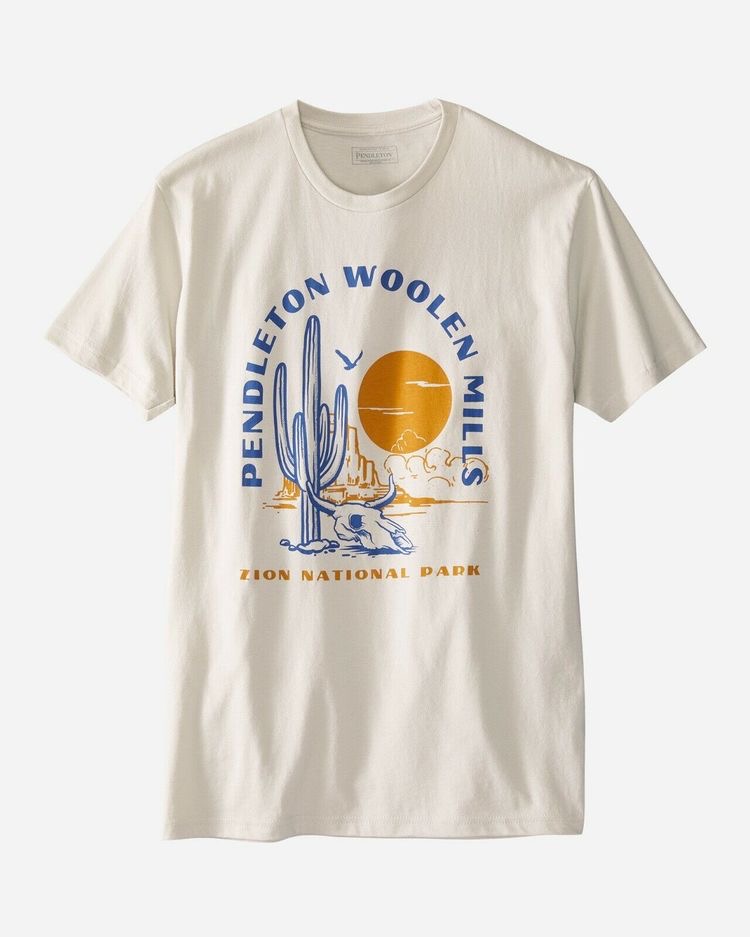
It's hard for us to know which aspect of the design you are drawn to. I'll try to go through the elements I see in the design. Perhaps it can help you narrow down what exactly it is you are drawn to.
Googling the text on the t-shirt yielded the image in much higher resolution and the store page where the t-shirt was originally sold.
(It seems customers complain that neither the cactus nor the rock formation in the background has anything to do with Zion National Park and the company apologizes and promise to pass the information on to the designer. Perhaps that's why it's not on sale anymore?)
Obviously the setting itself gives us keywords like: desert, southwestern, America.
I notice the use of only two inks: orange and blue. Being complimentary colors, it's a classic combination. Using only two colors is in some cases referred to as duotone, but I don't think a search for that term will be fruitful as it's mostly used about photos printed with two inks.
Only using these two colors sort of gives the design a retro 1970s vibe. 1, 2 and 3-color prints were very common before 4-color printing became the standard it is today. The beige color of the shirt supports the retro vibe.
The design uses a coarse halftone screen to create the shades on the cactus and the skull. Nothing special in that. It's the most common way to make shades in printing, but I don't think the shading is absolutely crucial for the design and I also don't think it had to be so coarse, so I suspect it's added to support the retro vibe.
The drawings are in a realistic, but slightly cartoony style. Similar to the inked drawings seen in classic comic books from the 20th century. As mentioned in comments, you could call it line art as the drawings mostly consist of completely solid lines.
The text is in some kind of Art Deco inspired typeface. Perhaps this particular kind of sans-serif font with wide vertical strokes has a name, I'm not sure. Even though Art Deco originates from the beginning of the 20th century, I still think the font supports the 1970s vibe somehow. There are tons of similar fonts. One that comes to mind right now is Anchor Jack.
There are a few things that makes it obvious to me that this isn't an old design. It sort of smells a bit of digital vector collage. The different elements looks like they aren't drawn at the same scale - perhaps not even by the same artist. The lines are thicker on the cactus than on the skull. The rock and the sandstorm in the background have smooth and blobby edges like what you get when auto-tracing a drawing. The sun could be a perfect vector circle - hard to tell because of the fabric bulging. And what are those thin, horizontal clouds doing there? The bird looks pasted in and could be a silhouette traced from a photograph (or simply found online by the designer).