46

I'm currently working on a logo for a client. Here is the work in progress. enter image description here

It seems obvious to me that the S should align with the line above. I feel that the best way of aligning it however is to align the bottom part of the S rather than the top curve, even thought the top curve does protrude more. See the following example enter image description here

Also at the other end of the logo, the A I feel can do something similar, minimising the white space triangle at the end of the logo

enter image description here

The end result I think is more pleasing in its alignment enter image description here

I feel that this is correct, but my client is questioning it. This alignment is a habit I have picked up during my career, so I haven't been formally taught this, in fact I can't remember where I picked this up.

Tell me, have I picked up a bad habit here? Is my client correct? If this is correct does this type of alignment have a name? Or is there an article somewhere I can refer my client to?

14
  • 3
    I don't think that this kind of alignment has any name. But the end result is looking even more balanced. It is good.
    – bharat
    Commented Aug 6, 2015 at 9:56
  • 2
    @bharat I genuinely don't know :-) I realise that isn't very helpful. I guess "optical" is commonly used to mean "by eye, not by absolute rule", it just feels like the intuitive name to me, and it's come up in conversations with other designers and everyone's know (or, figured out) what was meant. The other terms I discovered while struggling to find a reference to link to for "optical alignment"... Commented Aug 6, 2015 at 13:58
  • 1
    The Complete Manual of Typography (by James Felici and published by Adobe Press) goes over this very thing. What you naturally intuited, I had to learn by reading this excellent reference! Commented Aug 6, 2015 at 20:37
  • 3
    Yep 'optical' alignment vs. 'mathematical' alignment. The former is what your professional design skills are for. :)
    – DA01
    Commented Aug 6, 2015 at 21:02
  • 1
    The customer is always right, even if the customer is an idiot. But you can always say "Which one of us has a master's degree in design? Let me do the job you hired me to do." Commented Aug 9, 2015 at 17:15

5 Answers 5

46

Yup, these are legitimate things and they have names.

"Visual alignment", or, "Optical alignment"

This is the general principle - you're aligning by eye by what visually looks right, rather than by rule. It's used not just in typography but anywhere visual consistency is important, for example in designing icon sets - making icons with curves look neat when lined up with icons with straight edges.


The more specific technical terms below are not very commonly used (I had to look them up), they're just here for the curious.

Typographical Overshoot

This is when a character passes the appropriate vertical point because doing so looks more natural than stopping strictly. Joojaa's answer has lots of great examples of this, I'll just add this one from Microsoft's typography standards (don't laugh, despite unleashing Comic Sans on the world MS have a generally pretty good typography team) that shows it's not just the baseline where this is used:

enter image description here

Optical margin alignment

Essentially horizontal overshoot, usually applied to curved or slanted characters, and other characters with little meeting the edge that would look wrong against a hard line. It's basically tight kerning at the margins, and the characters that it is applied to are generally the same ones that would receive tight kerning elsewhere.

Here's how Wikipedia currently illustrate it:

enter image description here

1
  • 3
    To those familiar with LaTeX, optical margin alignment may be better known as character protrusion, as this is the term used by the microtype package that provides control over this and several other typographical fine-tuning techniques.
    – sigma
    Commented Aug 10, 2015 at 13:07
37

If you look at many fonts you'll notice that the curvature of the letter 's' pierces the perfect alignment of the baseline and of many other small letters. And as a general rule round shapes tend to do this - pierce the baseline of straight edges. I had an article about this phenomenon, and why it happens, somewhere in my bookmarks but the link evades me at the moment.

Round shapes pierce the baseline

Image 1: Some examples of round 's' piercing the baseline, with the baseline piercings highlighted.

If you look, even fonts that are very geometric do this (see Image 1). This happens more often than it doesn't - so much so that I've heard it spoken of as a rule. However note how the amount differs from situation to situation and shape to shape. So still today it's your eyes that decide.

If your eye is keen you'll also notice that some letterforms also pierce the vertical sideways. That is because the same phenomenon also happens there.

Curve of "S" extends to right of alignment with vertical serif

Image 2: Same effect sideways. This commonly happens if you have straight lines and curved lines mixed sideways.

PS: Sorry, fonts available on my temporary workstation are a bit limited.

0
17

This is a technique called overshooting (or overhanging). The reason why we use overshooting is because the way we perceive things as humans (at least in terms of pure mathematics) is inaccurate.

Don't believe me? Let me explain:

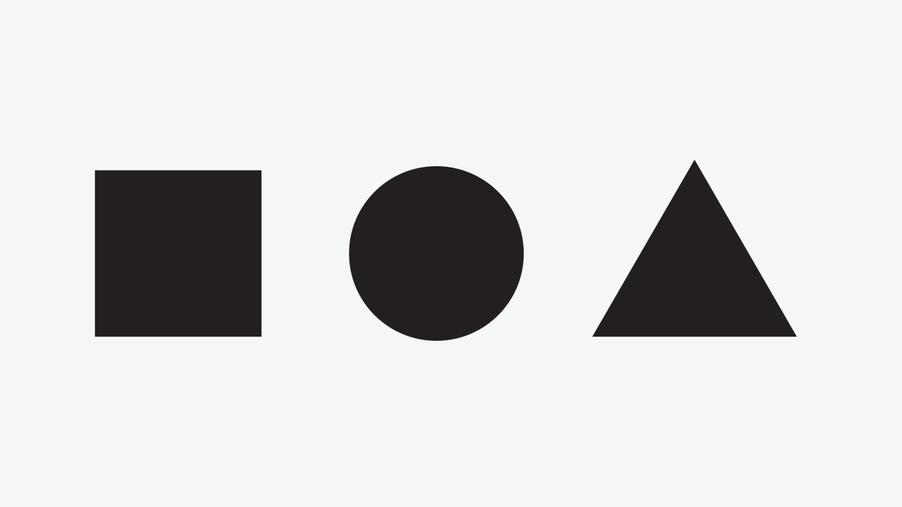
Consider this image:

enter image description here

Does the circle and triangle feel like they have the same weight to you? The truth is that they have the same height but a different area.

Now let's show how they look with the same area:

enter image description here

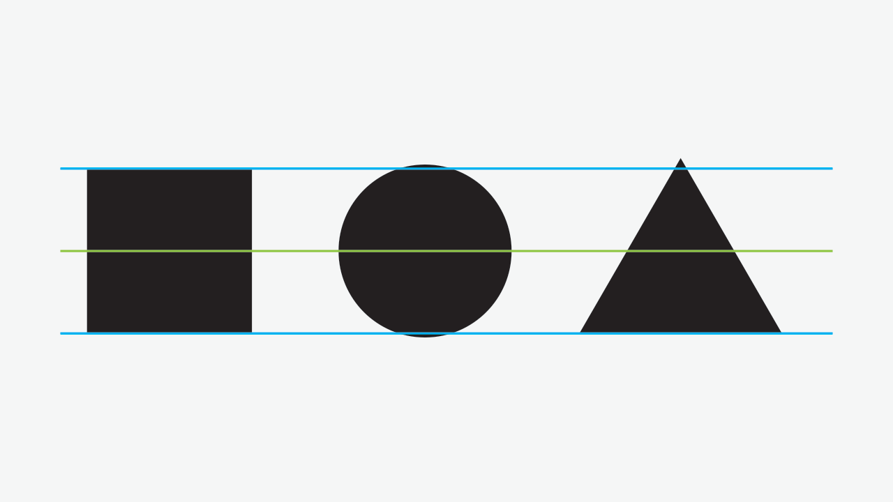
Notice the overshooting that has been created for both the circle and triangle. Both the circle and triangle look visually imbalanced still (especially the triangle) but with some playing around with scale and aligning the base of the triangle with the square, we get the following, visually appealing image:
enter image description here

Without guides:

enter image description here

Note that the overshooting still occurs with both, but in different ways. This is quite the opposite to bad practice, it's what is necessary in order to get proper visual balance. We often need to play around with shapes sizing, width, spacing, and alignment based on the specific subjects that we're using. There's no specific formula to this, it depends on the composition and desired result.

Keep in mind that when you change the vertical sizing, you'll likely need to change the horizontal spacing the same amount to keep proper white space:

enter image description here

The stroke width also comes into play when it comes to visual alignment. Take a look at this:

enter image description here

It doesn't feel quite right even though the scaling and spacing is the same, huh?

The conclusion here is that we should increase the amount of whitespace as we increase the stroke to keep the same visual balance. In fact, when we have counter forms, they overpower the form’s outline and their equilibrium becomes more significant than the solid form itself. This is exactly what Nintendo did when designing their Nintendo switch logo.

To read in more detail, check out Fábio Martins' article The Art of Eyeballing – Part III: Overshooting from which I got the images and some of the content in this answer from.

Also check out this great article on typographic illusions that talks about this effect.

5
  • I've never heard it called 'overshooting'. But seems to work!
    – DA01
    Commented Aug 7, 2015 at 22:21
  • 1
    @DA01 user568458 also called it "Typographical Overshoot" and I've seen it around before, I think it's relatively standard Commented Aug 7, 2015 at 22:23
  • 1
    I've always used the term 'overhang': ilovetypography.com/2009/01/14/inconspicuous-vertical-metrics But 'overshoot' works just as well!
    – DA01
    Commented Aug 7, 2015 at 22:28
  • @DA01 That article uses both :P Commented Aug 7, 2015 at 22:30
  • 3
    I'm going to combine it and call it overshang!
    – DA01
    Commented Aug 7, 2015 at 22:41
6

I don't have any articles to back it up, but I can tell you from experience that you are correct. Just like manual kerning, spacing and aligning letterforms (and other objects) like this is part science, part art. Let your eye and gut guide you rather than exact numbers and math.

4

The concept at play here is that your eye (i.e. your brain) processes curves differently than it does straights. In a manner somewhat similar to how you "see" a halftone as a smooth tone, your eye finds an averaged location as the perceived "edge" of a curved letterform. Your positioning of your logoforms is "correct" according to this notion. The key of course is "how to convey to the literal-minded client who fixates on whether serifs are sticking out or other such literal positioning.

This kind of thing comes into play ALL THE TIME in typography. For example, in a centered headline, letting the trailing period at the end of a line overhang, thus the line is technically off-center, but the average weight of the line is dead-center.

Not the answer you're looking for? Browse other questions tagged or ask your own question.