3

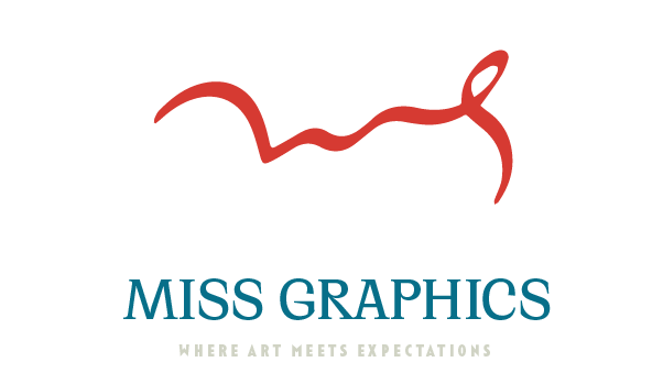
I would like to know if the calligraphy style signature looks good and if the type face for miss graphics compliments it. Also, which colour scheme looks best. Thank you :)My personal logo

Miss here means mr. mrs. ms.

I am a female so I am Miss Graphics basically. The calligraphy is a signature I created myself of M and G. Design process involved experimenting with various icons and signature fonts but in the end I decided to go for signature logo given the fact that Miss Graphics should look like my name and the signature has to represent that.

When I couldn't find the right font I drew the M and G myself on touch screen and added calligraphy brush effect on illustrator. This process has taken place over a very long period of time but I want to finalize my branding now. People already know me by the name "Miss Graphics" so there is no changing that. I just need to decide on the branding. I would love your opinion on whether this signature look is working or I should try something else. Thank you :)

1

2 Answers 2

3

There are many things that can be improved on your logo


In graphic design there aren't many dogmas, but I dare to say one of them is never present a framed logo unless that frame belongs to the design. The grey frames are destroying your three logos. If this were for a client, he/she would wonder how the logo would look like alone, without the grey frame. Or worse, they could ask to change the frame color!!! You are putting the grey frame as another element to consider in your logo when in fact it isn't part of it.

logos


Personally I discovered that it's a signature after reading the question. If I had to gather the main features of a signature are:

  • Fast and thin line
  • Floating in the air or above a dotted or thin line
  • Dark color

None of the three is represented in the signature, which makes it difficult to interpret it immediately.


One of the Gestalt laws is the proximity:

The Law of Proximity states that objects that are near or 'proximate' to each other tend to be grouped together.

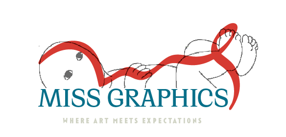
The closeness between the signature and the text makes everything to be interpreted as a single element, taking away the signature's presence. My first impression was a baby lying down.

Baby

I think it's necessary to extend the distance between the text and the signature so that it's interpreted as such:

Distance

Or make the text have a double reading: as a text and as the signature baseline:

baseline

Finally, if there was a statistic of the ink color we used when signing, we could say 50% black ink, 40% blue ink, a minimum percentage of red ... but baby blue??? yellow????...may be, but the further away from the essential color of a signature is, the less it will look like.


I didn't do any analysis of the small text, you can barely see it. In a logo reduction will disappear completely.

1
1

I think the signature could be moved away from the text a bit. But more importantly the signature should be of your name. Say I was doing similar I might do:

  • Mr Scott (type) with RS (signature)
  • Mr Scott (type) with Ryan Scott (signature)

If I was already known as "Mr. Graphic" I would do it as:

  • Mr Graphic (type) with Ryan Scott (signature)

But MS as the signature doesn't make sense to me. Its not a signature. You should use either your first name, or your first initial.

Your Answer

By clicking “Post Your Answer”, you agree to our terms of service and acknowledge you have read our privacy policy.

Not the answer you're looking for? Browse other questions tagged or ask your own question.